The Designers Republic™
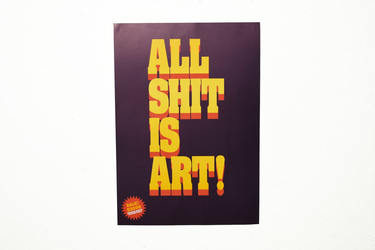
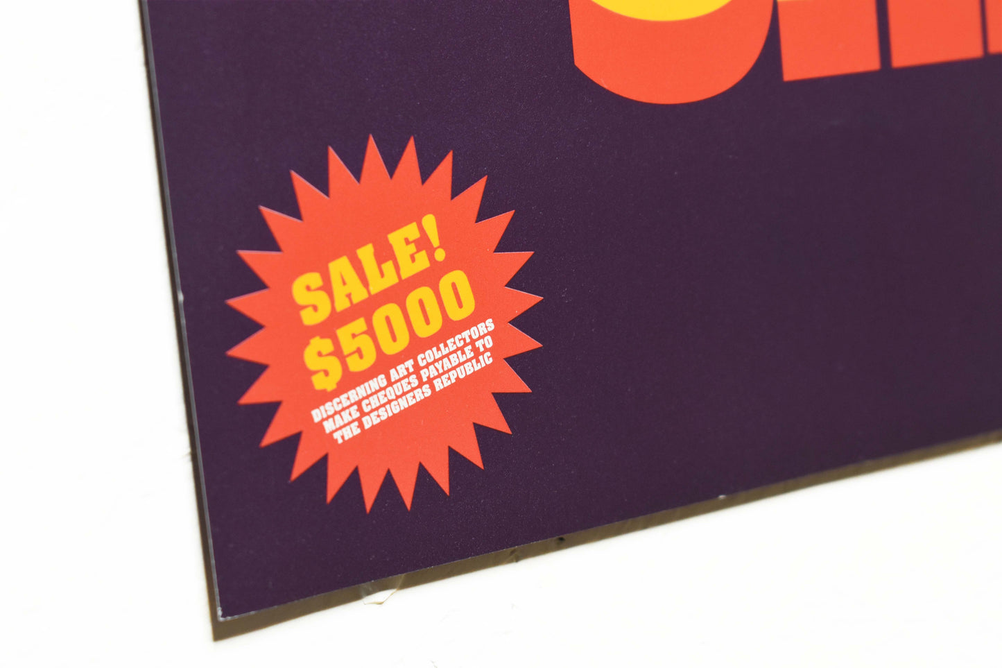
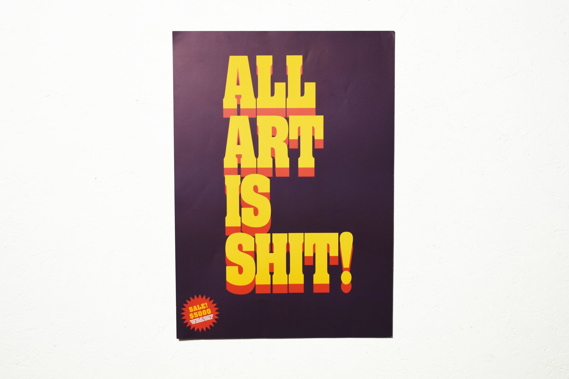
All Art is Shit / All Shit is Art - Double Sided A3 Lithoprint
All Art is Shit / All Shit is Art - Double Sided A3 Lithoprint
Couldn't load pickup availability
It’s May 1995, and following the publication of Emigre Magazine’s TDR™ issue the previous year, we’re at the launch of ‘Customised Terror’ our second group show in NYC in as many months. The first was ‘Synaesthesia’ at The Mary Anthony Gallery on Broadway, curated by Warhol-factory alumnus Ronnie ‘Blaise’ Cutrone. This one is curated by Ronald Jones at SoHo’s Artists Space.
The theme is ‘transmogrification’ (the conceptual point where, during ‘a strange or preposterous metamorphosis such as frog becoming a prince for example, it is neither one thing nor the other). Ronald is interested in TDR™’s appropriation of corporate brands into a ‘global slang for the common man’, focussing on how these marks are read rather than how they are ‘written’.
TDR™ has been commissioned to create around 10-15 new works for the show with Bryan Crockett and Brian Tolle.
Artworld buzzwords around the time were Installation, Intervention and Interaction. Scoping the Greene St. gallery space I wanted to create something site specific that made people feel they were part of the show.
It was also a time of a lot of jibber-jabber about the relationship between graphic design and art. The harder we tried to distance ourselves from Art with a big ‘A’ (before the cock could crow for a third time) the more the Artworld (with a big ‘A’) seemed to court us.
Either way, in the gallery space there was a long corridor leading to the toilets with a blank space facing you as you went for a ‘comfort break’. It seemed an ideal position for a work which could command a captive audience walking the corridor.
Apparently most artists didn’t want their work shown there, next to the toilets. I thought it was an ideal spot to provoke a response to ‘All Art Is Shit’. The only way back to the main gallery was back down the same corridor where there was another blank wall ‘going spare’.
I wanted people to feel they were contributing to the show so flipped the first piece to read ‘All Shit Is Art’.
The design itself is based on the then omnipresent Pulp Fiction film typography.
The original pieces were 2m x 1m digital inkjet prints laminated in a material used to insulate tech in space stations.
When we reprised our content from the show at The Forum Bar in Sheffield later that year, we produced limited run A3 lithoprints of the key works (see MacWanker / Bank of Jesus / Fleshburger etc). These sold out quickly but we reprinted a ltd edition around 2001 when we launched The Peoples Bureau For Consumer Information online retail experience.
The ‘All Art Is Shit’ / ‘All Shit Is Art’ was designed as a double sided print to allow the owner to decide for themselves which side of the cubicle door they were on.


